
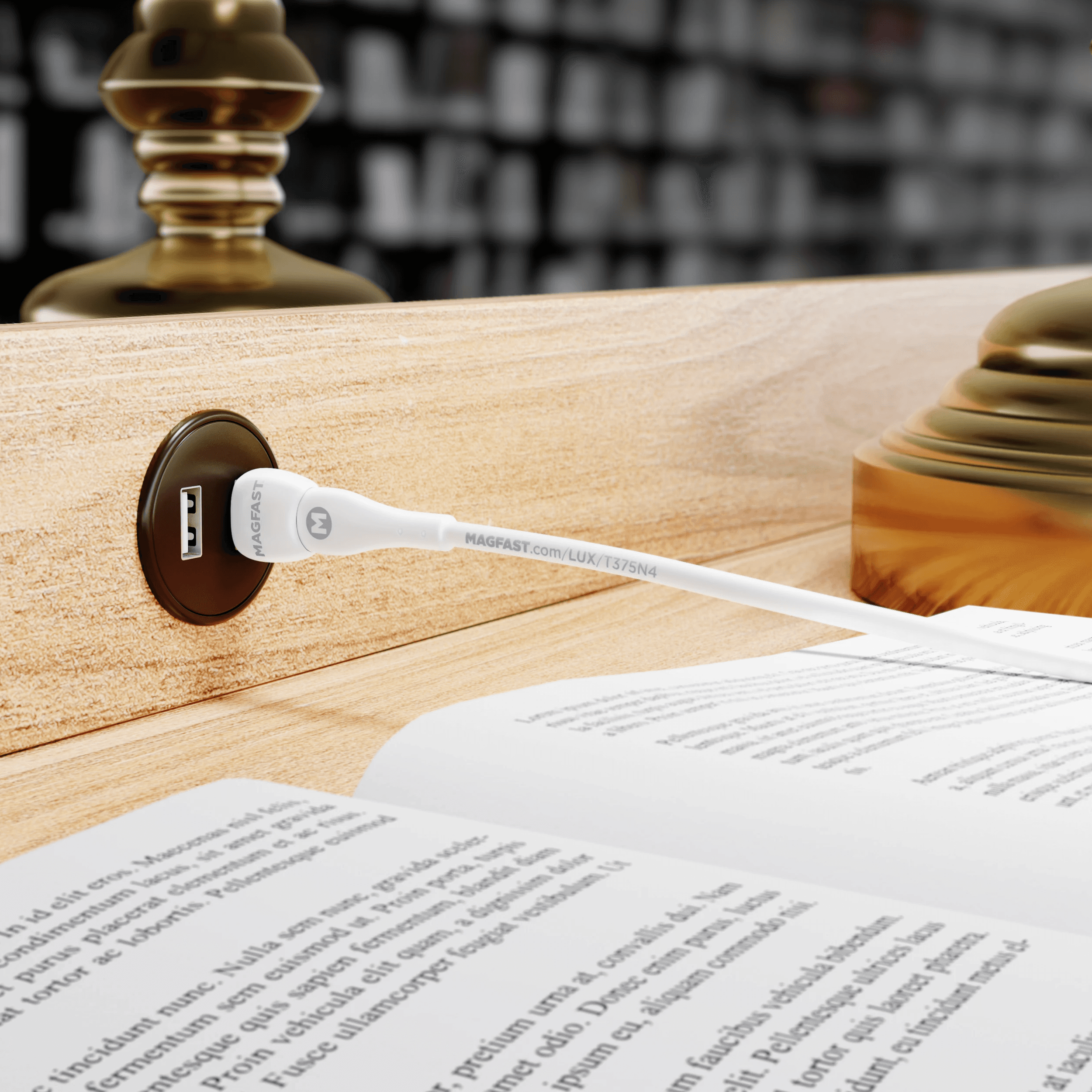
Walk into a carefully designed kitchen or living room and look for the phone chargers. You will usually find them behind the toaster, under a side table, or dangling from an outlet by the sofa. Interior designers spend weeks choosing hardware finishes and lamp bases, and then a white plastic brick undoes it.
That is starting to change. As phones became the object people touch most in a day, a few charger makers began treating the thing that holds them like furniture.
Why chargers stayed ugly
Chargers were designed as consumables. Manufacturers bundled them with phones, priced them low, and expected you to hide them. Nobody chose a charger for how it looked, so nobody designed one to be seen.
Two shifts broke that pattern. Phone makers stopped putting chargers in the box, so people started choosing their own. And magnetic wireless charging let a charger become a stand, something that sits on a counter and holds a phone upright rather than a cord that trails across it.
Materials that belong in a room
Once a charger lives in plain sight, material matters. Metal, stone and ceramic read as permanent. Glossy plastic reads as temporary.
MAGFAST, a charging company based in New York’s Hudson Valley, designs its Air Pro stand with that in mind. The company describes it as a sculpted stand in aircraft-grade aluminium and steel with a soft-touch finish, weighing about 2.2 pounds. That weight is partly functional, since a heavy stand stays put when you lift a magnetic phone away. It also gives the stand the settled presence of a small sculpture on a counter.
Founder Seymour Segnit frames the Air Pro as a premium kitchen appliance people actually use every day. Everyone ends up charging a phone somewhere, and the company’s argument is that the spot deserves the same care as the coffee machine next to it.
Colour as a finish choice
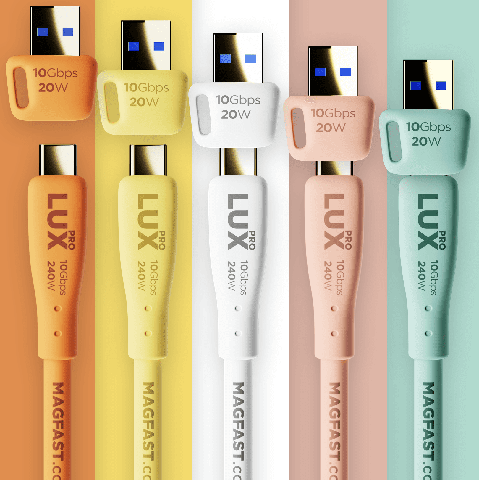
Colour is the next step. In its July 2026 summer campaign, MAGFAST offered its range in six colourways: Ceramic White, Piano Black, Seafoam Green, Sunshine Yellow, Juicy Orange and Candy Pink, in a glossy ceramic finish. The company’s pitch was direct: a charger that matches the room it lives in. A yellow kitchen gets a yellow charger.
For designers, that opens a small but useful option. A charging point can pick up an accent colour from tiles or textiles instead of fighting the palette.
How to place a charger in a designed room
- Choose the spot first. Pick the place phones already land: a kitchen island, an entry console, a bedside table.
- Hide the power, show the object. Run the cable through a desk grommet or behind a cabinet so only the stand is visible.
- Match finishes. Tie the charger to nearby hardware, such as brushed metal near brushed taps or white ceramic near white stone.
- Go heavier. A weighted stand looks deliberate and stays in place.
- Keep one per zone. A single good-looking stand in each area beats a cable in every outlet.
A small object with a big footprint
Chargers are among the few pieces of technology in a room that everyone in the household uses. Treating them as part of the design, rather than something to hide, is the same shift that happened to speakers, lamps and thermostats a decade ago. The result is a room that looks finished even when the phones are charging.